- ABOUT GSI
- AI
- HPC
- INDUSTRIES
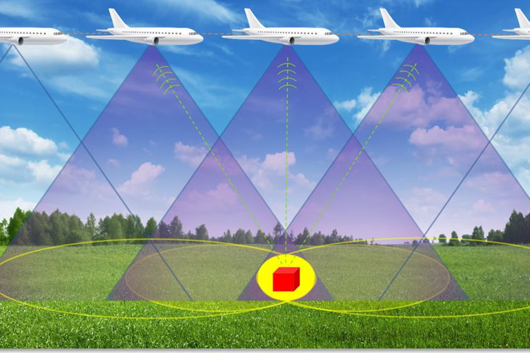
- AEROSPACE & DEFENSE
- MEMORY
- RESOURCES
- INDEPTH
-
-
AI’s Energy Dilemma

-
-
- INTEGRATORS
-
- TOOLS
-
- INDEPTH


Home Target Classification with Doppler-Pulse Radar and Neural Networks
Authors: Braden Riggs and George Williams
In the world of data science the industry, academic, and government sectors often collide when enthusiasts and experts alike, work together to tackle the challenges we face day-to-day. A prime example of this collaboration is the Israeli Ministry of Defense Directorate of Defense Research & Development (DDR&D)’s MAFAT challenges. A series of data science related challenges with real-world application and lucrative prize pools. In the program’s own words:
The goal of the challenge is to explore the potential of advanced data science methods to improve and enhance the IMOD current data products. The winning method may eventually be applied to real data and the winners may be invited to further collaborate with the IMOD on future projects.
– MAFAT Competition Coordinators
Given the recent inception of the program, there haven’t been many challenges yet, however, there are expected to be a variety of challenges ranging from complicated Natural Language Processing puzzles to computer-vision related endeavors.
One such challenge, their second one made available thus far, caught my eye. It involves creating a model for classifying living, non-rigid objects that have been detected by doppler-pulse radar systems. The challenge, “MAFAT Radar Challenge — Can you distinguish between humans and animals in radar tracks?” implores competitors to develop a model that can accurately distinguish humans from animals based on a spectrum of radio signals recorded from various doppler-pulse radar sites on various days. If you are interested in participating I recommend visiting the challenge site before reading on.


The key to developing an accurate and competitive model is to first understand the data, how it was sourced, and what it is missing. Included with the competition is 5 CSV files containing the metadata, and 5 pickle files (serializing Python object structure format) containing doppler readings that track the object’s center of mass and slow/fast time readings in the form of a standardized I/Q matrix.
Before we go any further it is worth breaking down a few key concepts relating to signals and the specific types of data collected. The signal readings that make up the dataset fall into two levels of quality, High Signal to Noise Ratio, and Low Signal to Noise Ratio. This reading, High SNR and Low SNR divides the set into two levels of quality, one with high clarity that hasn’t been heavily tainted by a noise generating process, and one with low clarity that has had aspects such as weather impact the quality of the reading.

You might be wondering why we would even choose to include low SNR readings given the impact noise has on the data, however to my surprise this data is actually quite valuable when developing an effective model. Real-life is messy, and the true reading one might expect to see will not always be high quality, hence it is important to make sure our model is adaptive and geared towards a range of data readings, not just the highest quality ones. Furthermore, we are working with a limited amount of data (which we will explore in-depth below) and hence want to utilize everything at our disposal for training the model.
Another series of concepts worth understanding is the notion of an I/Q matrix and what a doppler reading entails. An I/Q matrix consists of an N x M matrix, in our case a 32 x 128 matrix, that stores the slow and fast signal readings as cartesian elements, where “I” represents the real part and “M” represents the imaginary part. You can picture each row of this matrix as representing a signal pulse from the source, and each column of this matrix representing a reading for returning radio waves that have bounced off objects or targets in the direction of interest. The time between pulses is “slow time” and the time between readings of said pulses is considered “fast time”, if you are still confused or further interested I highly recommend you follow this link for more information.

Also included in the dataset, separate from the I/Q matrix, is the doppler burst readings. Consisting of one row of 128 readings the doppler burst can be used to track an object’s speed and direction of travel. Much like how the sirens on a police car change sound as the car drive past you, the doppler effect relates to the range in wavelength characteristics of objects in motion. By bouncing radio signals off objects of interest we can see how the radio waves change shape and hence infer a number of parameters about the object of interest such as speed, direction, and acceleration.
Great, now that we have a bit of terminology under our belt it is time to discuss the five file pairs provided for the competition. These file pairs, whilst in the same format, differ from each other greatly and form five distinct sets:
As I have already alluded to, the training set isn’t populated with a satisfactory amount of data points. This constitutes the challenge, generating a sufficient amount of data to train the model on, from the supplementary synthetic, background, and experimental sets. This challenge is further exacerbated by the imbalance of the data.
With such a small dataset it is important to ensure the data is balanced and unbiased as this can lead to significant misinterpretations of the set by the model, and small inconsistencies can get extrapolated into significant errors.

The first key imbalance is the difference between the number of high and low SNR tracks. As you can see from the adjacent graph there are almost two thousand more low SNR data points than high SNR.
|

The second key imbalance is between the number of Humans and Animals in the dataset. Clearly, with such a significant difference the model might become biased towards predicting animal instead of human, since this prediction would net a high accuracy for little effort on the model’s part.
|

Both of these disparities cause significant issues when building the model. If we take a closer look at the relationship between signal quality and target type we see that the majority of animals have low SNR readings and the majority of humans have high SNR readings. Whilst this may seem minor, extrapolated over a number of training intervals our model may make the mistake of conflating a cleaner signal with that of a human, and a noisy signal with that of an animal.
|
Interestingly enough, along with the data provided, a baseline model was included for the competitors. This model serves as an example of how the final submission should be formatted as well as providing a relative starting point for competitors. So what is the baseline model?
The MAFAT challenge organizers decided to start strong by beginning with Convolutional Neural Network (CNN), a form of artificial intelligence designed for computer vision problems. The model takes an input image and weights parameters based on their importance in discerning the final result, which in our case would be an animal or a human. This particular CNN has two convolutional layers, followed by two max-pooling layers, which again is followed by two “dense” layers, before finally being activated by a ReLU function and regularized with a Sigmoid function. This is better visualized with a diagram:


As you can see in the above diagram we start with the 126×32 I/Q matrix. This matrix, along with 15 others, are aligned, and the first convolution of training happens, of which the result is altered and resized to a different dimensionality. Eventually, the model concludes with a single value, a number somewhere between 0 and 1 where the closer to 0 the more likely the signal is an animal, and the closer to 1 the more likely the signal is human. It is alright if you don’t understand the logic or the terminology behind this baseline model, these techniques are quite elaborate and if I were to go into detail this blog would be twice as long. If you are interested this link goes into more detail.
In addition to the model, the baseline attempt includes a few other noteworthy strategies for increasing the accuracy of prediction. As discussed earlier the training set is heavily imbalanced, to help amend this discrepancy the training set is supplemented with more data from the experiment set. This is to help the CNN understand and recognize human patterns within the data and will ideally lead to a higher level of accuracy. In our own attempt, we trained the model without changing the baseline structure, and validated (scored the accuracy of the model) on a sample of the training data withheld from the model. The results are visualized below:

As you can see from the results the model performed perfectly on the training data, and almost perfectly on the validation set. For a baseline model, this is pretty impressive, right? Well as it turns out, by the admission of MAFAT themselves, the baseline model doesn’t perform well on the test set, averaging only a 75% accuracy. Given the scope of the project and the technology they are trying to produce, 75% simply won’t cut it. Hence we have to go back to the drawing board to figure out how we can create a more accurate model.
So now that we understand how the baseline model works we need to understand what kind of mistakes the model is making on the test data. The best way to understand these patterns and the mistakes made by the model is to visualize the data, although this is easier said than done. Because of the high dimensionality of the data, it can be hard to visualize and understand in a meaningful way. Luckily for us, there is a solution to this problem, T-distributed Stochastic Neighbor Embedding for high dimensional data, also known as TSNEs. A TSNE is essentially its own machine learning algorithm for non-linear dimension reduction. It works by constructing a probability distribution over the different pairings of data where higher probabilities can be imagined as pairings of higher similarity. As the TSNE function continues it repeats this process, slowly predicting dimensionality until it reaches a stage where it is digestible to the human brain. Our code for producing the TSNE, along with the baseline notebook can be found here. In our case, we extracted the vector representation of the spectrogram using the final layer of the network before classification and computed the TSNE on the resulting vector.
Because of the stochastic nature of the algorithm, TSNE’s look different every time they are computed, however, they are useful for pointing out noteworthy clusters of similar data. Computing the TSNE for our model produces the following plot where:
Green = animal
Blue = human
Red = incorrect prediction in the validation set
Teal = location of a test set value

As you can see there are some pretty significant clusters of animals and a few clusters of humans. Because there are fewer humans in the training set the human clusters are less apparent when compared to the animal clusters. As indicated by the red points there are a few areas where the model makes incorrect predictions. This is noteworthy because it appears as though the red points form two distinct clusters themselves, suggesting that the majority of incorrectly predicted points are close to two separate epicenters. What is also noteworthy is that there are a significant number of teal points that also fall in these regions, which explains why the baseline model is only scoring around ~75%, because the model would be incorrectly predicting these points.
It also appears that the test set is relatively spread out not forming as clear of a center and being relatively even between animals and humans, although we can’t know this for sure as we don’t possess the labels for points at those locations.
Given this information, there are a number of different strategies we can explore for boosting the overall quality of the model or in creating a different model altogether. In an ideal world, we would have a larger training dataset, this would be a great solution to the problem as the more points we have to train on, the more chance the model has of understanding a pattern that can lead to the correct classification of the red clusters above. Unfortunately, this isn’t an option and we are limited to the data provided or any data we can gather from external sources. This seems like a good place to start because the distribution is so unbalanced between humans, animal, low SNR, and high SNR. By developing a better distribution of data, be that from the auxiliary sets provided, or from some external source, we can retrain the model and see how the results improve. Depending on the performance of the baseline model on a more balanced dataset, we can then move forward towards creating an improved model.
As I write this now some competitors have already scored accuracies greater than 95%. A leader board of competitors and their scores can be found here. This is a multipart series with more updates to come as we proceed through the competition.
IQ Modulation. (n.d.). Retrieved August 13, 2020, from https://www.keysight.com/upload/cmc_upload/All/IQ_Modulation.htm?cmpid=zzfindnw_iqmod
Saha, S. (2018, December 17). A Comprehensive Guide to Convolutional Neural Networks — the ELI5 way. Retrieved August 13, 2020, from https://towardsdatascience.com/a-comprehensive-guide-to-convolutional-neural-networks-the-eli5-way-3bd2b1164a53
Understanding I/Q Signals and Quadrature Modulation: Radio Frequency Demodulation: Electronics Textbook. (n.d.). Retrieved August 13, 2020, from https://www.allaboutcircuits.com/textbook/radio-frequency-analysis-design/radio-frequency-demodulation/understanding-i-q-signals-and-quadrature-modulation/
What is I/Q Data? (n.d.). Retrieved August 13, 2020, from http://www.ni.com/tutorial/4805/en/
All images used are either created by myself or used with the explicit permission of the authors. Links to the author’s material are included under each image.