- ABOUT GSI
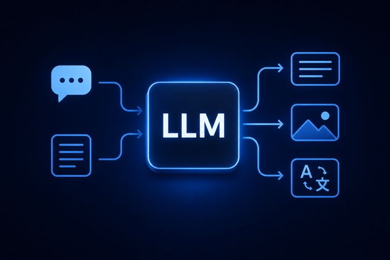
- AI
- HPC
- INDUSTRIES
- AEROSPACE & DEFENSE
- MEMORY
- RESOURCES
- INDEPTH
-
-
AI’s Energy Dilemma

-
-
- INTEGRATORS
-
- TOOLS
-
- INDEPTH


Home Two Tools Every Data Scientist Should Use for Their Next ML Project
Authors: Braden Riggs and George Williams
The more time you spend working with machine learning models the more you realize how important it is to properly understand exactly what your model is doing and how well it is doing it. In practice, keeping track of how your model is performing, especially when testing a variety of model parameter combinations, can be tedious in the best of circumstances. In most cases I find myself building my own tools to debug and analyze my machine learning models.
Recently while working on a slew of different models for MAFAT’s doppler-pulse radar classification challenge, read more here, I found myself wasting time manually building these debugging tools. This was especially tedious as I was working on building an ensemble, a collection of machine learning models for a majority classification strategy that can be very effective if done correctly. The problem with creating an ensemble is the variety of different models and diversity of classification that is required to make the strategy effective. This means training more models, performing more analysis, and understanding the impact of more parameters on the overall accuracy and effectiveness of your model. Again, this required me to spend more time trying to create my own debugging tools and strategies. To better utilize my time and resources I decided to turn to the range of tools available online for debugging and analyzing machine learning models. After trialing a few different options, I was able to narrow down my list to two great tools every data scientist should consider when developing and refining their machine learning apparatuses:
Weights and Biases
and
Uber’s Manifold
In this blog, I will discuss the two tools, what they are, how they are used, and how they can help you save time and stress on your next big project.

Those who don’t track training are doomed to repeat it.
– W&B product tag
Weights and Biases, or W&B, is a company based out of San Francisco that provide a range of deep learning and machine learning tools that can be seamlessly integrated into an existing or new project. Although W&B provides many functions, its main role is tracking the realtime performance of model variations within your project. To this end, it is incredibly useful. As I experimented with my project I often lost track of which changes I had made when, and if those changes had a positive or negative impact on the various evaluation metrics of my project. W&B allows you to store and visualize these evaluation metrics in a variety of ways. The two I found most useful included the charting and the tabling:


As you can see, the line charts track the performance of various models using different metrics during training. This allows for seamless side by side comparison to check for things like overfitting or which models performed the best on the validation set.
After creating an account on W&B’s website you have to install and log onto your profile from the environment you are using for your project.
!pip install --upgrade wandb
!wandb login <Your login code>
From there your circumstances may differ depending on which deep learning or machine learning tool kit you are using. For my project I used Keras, but the documentation for other projects is clear and easy to implement:
#Import the package
import wandb
from wandb.keras import WandbCallback#Initialize the W&B object
wandb.init(project="tester")#Link the model with W&B’s tracking metrics
model.fit(X_train, y_train, validationData=(X_test, y_test)    epochs=config.epochs, callbacks=[WandbCallback()])model.save(os.path.join(wandb.run.dir, "model.h5"))
As your model trains, the progress is tracked and updated in realtime on your W&B account where you can easily analyze and evaluate the performance of your model. From here you can choose to create a report providing a more professional and digestible view of your results which you can overlay with text and other visuals.
It cannot be overstated how helpful it is to track the performance of your models, especially when you are altering parameters and trialing a range of techniques. It is so helpful in fact, large companies such as OpenAI and Toyota Research regularly use and laud W&B as a flexible and useful tool for their projects.
Get started for free here.
For my project, I am creating an Ensemble. An Ensemble is a collection of machine learning algorithms that each individually train and predict on the same data. The advantage of an Ensemble is that it provides a range of different strategies for finding a solution and utilizes a majority vote that democratizes the classification by all the models. This is useful because whilst an individual model may predict some portions well, it may struggle on other portions of the data. Hence, an ensemble is just the machine learning version of the strength in numbers adage. In order for an ensemble to perform well, the individual models that make it up must have diversity of prediction. Diversity of prediction is a fancy way of saying that the models can’t all be predicting exactly same for the exact points, rather they should be performing well on different selections of points. This raises the question however, how do you know if the parts of your ensemble are diversifying their predictions? This is where the transportation tech giant Uber’s Manifold comes in.
Uber’s Manifold is an open-source long-term project that aims to provide a model-agnostic visual debugging tool for machine learning. In layman’s terms Manifold allows you to visualize which subset of the data your model or models are underperforming on and which features are causing ambiguity.
As you can imagine this is very useful when working on ensembles. The tool creates a widget output that can be interacted with within your notebook for quick analysis. It is important to note, however, that this tool currently only works in classic Jupyter notebooks. It doesn’t function on Jupyter Lab or Google’s Colab.
Manifold works by using k-means clustering, a neighbor grouping technique, to separate the prediction data into performance similarity segments. You can imagine this as splitting the data into subcategories of similarity. The models are then plotted along each segment, where the further to the left the model is the better it performed on that segment, you can see this on a randomly generated example below:

In the example above we have three models and the input data has been split into four segments. Using log-loss as our performance metric we can see that model_1 performs poorly on segment_0, whereas model_2 performs poorly on segment_2. The shape of the lines represents the performance distribution and the height of the lines represents the relative data point count at that log-loss. So again, for example, on model_1 in segment_1, we can see that there is a low but intense concentration of points with a log loss of 1.5.
Manifold also offers a feature attribution view:

The feature attribution view highlights the distribution of features for each segmentation. In the example above data group 0 includes clusters two and three, and we are comparing them to data group 1 which includes clusters zero and one. Along the x-axis is the feature values and the y-axis is the intensity of the cause. Feature_0 highlights these differences at small intervals whereas feature_1 highlights the histogram of feature values. Because this is an interactive widget the values aren’t shown unless moused over. If you are interested in a closer look check out the example here.
Manifold is still in the early stages of development and there are still some bugs and nuances to the tool, however, this should not discourage you from trying to use it in your own project. In my circumstances, I needed to install a few packages to get it to work in my Jupyter notebook. This required some trial and error but eventually resulted in the following commands:
!jupyter nbextension install --py --sys-prefix widgetsnbextension
!jupyter nbextension enable --py --sys-prefix widgetsnbextension
!pip install mlvis
!jupyter nbextension install --py --symlink --sys-prefix mlvis
!jupyter nbextension enable --py --sys-prefix mlvis
It wasn’t sufficient to just install the nbextention packages, I also had to enable the packages. From here we can import a few tools for our demo:
from mlvis import Manifold
import sys, json, math
from random import uniform
To use the Manifold framework your data needs to grouped into three specific formats. The first group is all of your x-values, which must be in a list of dictionaries:
#Example of x-values
x = [
  {'feature_0': 21, 'feature_1': 'B'},
  {'feature_0': 36, 'feature_1': 'A'}
]
The second group is your different model predictions, which must be a list of a list where each list is a different model’s predictions:
#Example of model predictions
yPred = [
  [{'false': 0.1, 'true': 0.9}, {'false': 0.8, 'true': 0.2}],
  [{'false': 0.3, 'true': 0.7}, {'false': 0.9, 'true': 0.1}],
  [{'false': 0.6, 'true': 0.4}, {'false': 0.4, 'true': 0.6}]
]
The final group is the ground truth values or actual correct y-values, which are in a list of values:
#Example of ground truth
yTrue = [
  'true',
  'false'
]
Once your data is in this format we can pass the values into the Manifold object and execute to get the widget, which looks like the examples above:
Manifold(props={'data': {
    'x': x,
    'yPred': yPred,
    'yTrue': yTrue
}})
Using the Manifold tool you can then visually evaluate how your different models are performing on the same data. In my case, this was very helpful for building the ensemble because it allowed for me to understand which models performed where, and which data clusters were the hardest for the models to classify. Manifold also helped me evaluate the diversity of prediction for each model within the ensemble allowing me to construct a more robust apparatus that was able to classify over a range of different inputs.
A link to my earlier MAFAT Challenge blog: https://medium.com/gsi-technology/training-a-model-to-use-doppler-pulse-radar-for-target-classification-2944a312148c
Li, L. (2019, August 12). Manifold: A Model-Agnostic Visual Debugging Tool for Machine Learning at Uber. Retrieved September 04, 2020, from https://eng.uber.com/manifold/
Lutins, E. (2017, August 02). Ensemble Methods in Machine Learning: What are They and Why Use Them? Retrieved September 04, 2020, from https://towardsdatascience.com/ensemble-methods-in-machine-learning-what-are-they-and-why-use-them-68ec3f9fef5f
Weights & Biases — Developer tools for ML. (n.d.). Retrieved September 04, 2020, from https://www.wandb.com/
All images used are either created by myself or used with the explicit permission of the authors. Links to the author’s material are included under each image.